Meg’s Entryway - Designing with Wallpaper
As an Interior Designer, I often sit in my home contemplating what I can re-design. My husband hesitantly smiles as I express, “We should repaint this room!” or “I wonder if I can cut into this wall and create a recessed arched built-in” or “I found these fabulous chairs on sale! They’ll be here next week.” Hey, in my defense he knew what he was getting into when he married me.
My little entryway needed something to really set the tone, as this is our main entrance and it gets a lot of use. I sat and contemplated my vision and knew wallpaper would be the answer.
The starting point had a lot of bandaids. A shiplapped nook that was created by my dad and I several years ago served purpose as a catch-all for many years. Since this project, my dad has sadly passed away from a battle with lung cancer. I knew I wanted to keep parts of this nook intact for sentimental reasons but it needed an update. Additionally, the peel and stick wallpaper from Target was a nice temporary solution for a while as was the small mirror. But let’s be honest - that boob light, the door, and the ugly old flooring were all eyesores that made me cringe everyday.
Here’s the BEFORE:
Fair warning: Once you give a Designer a project within her own home, it really snowballs into a much larger project to get it *just right*. The good news: this Designer isn’t afraid to roll up her sleeves and get sweaty. Let’s break down this journey together.
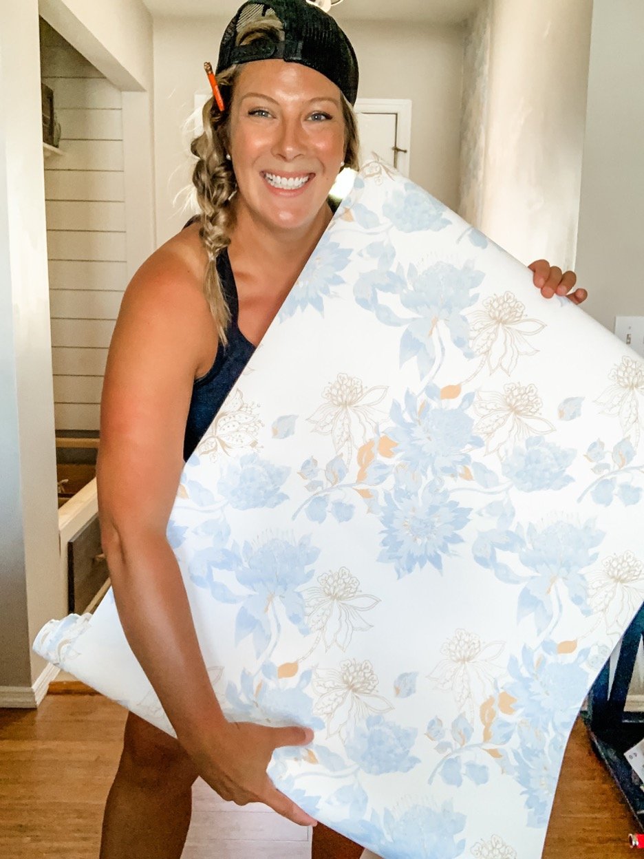
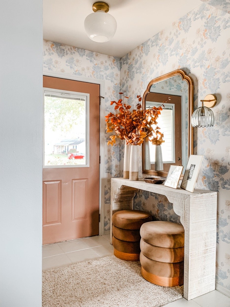
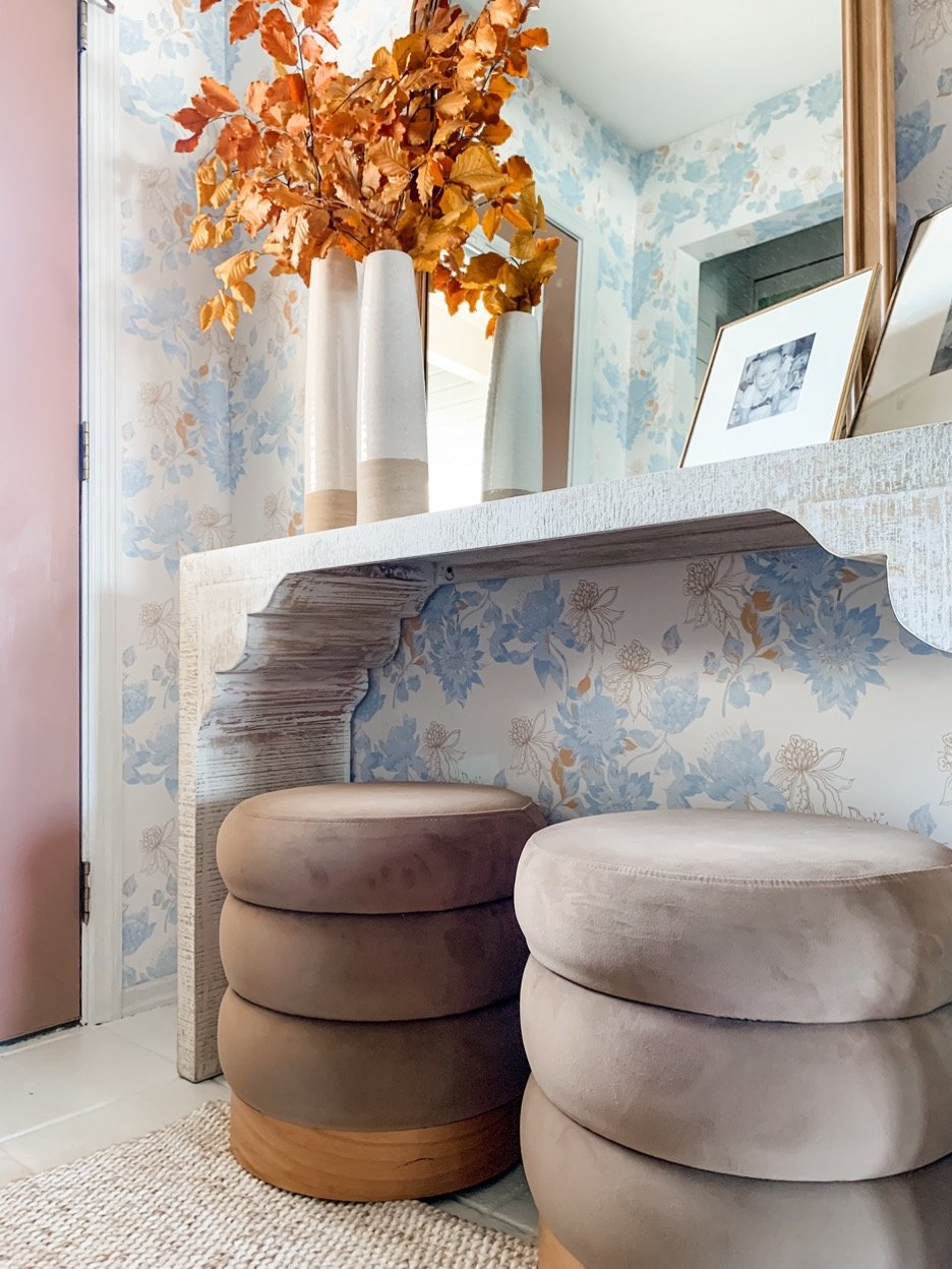
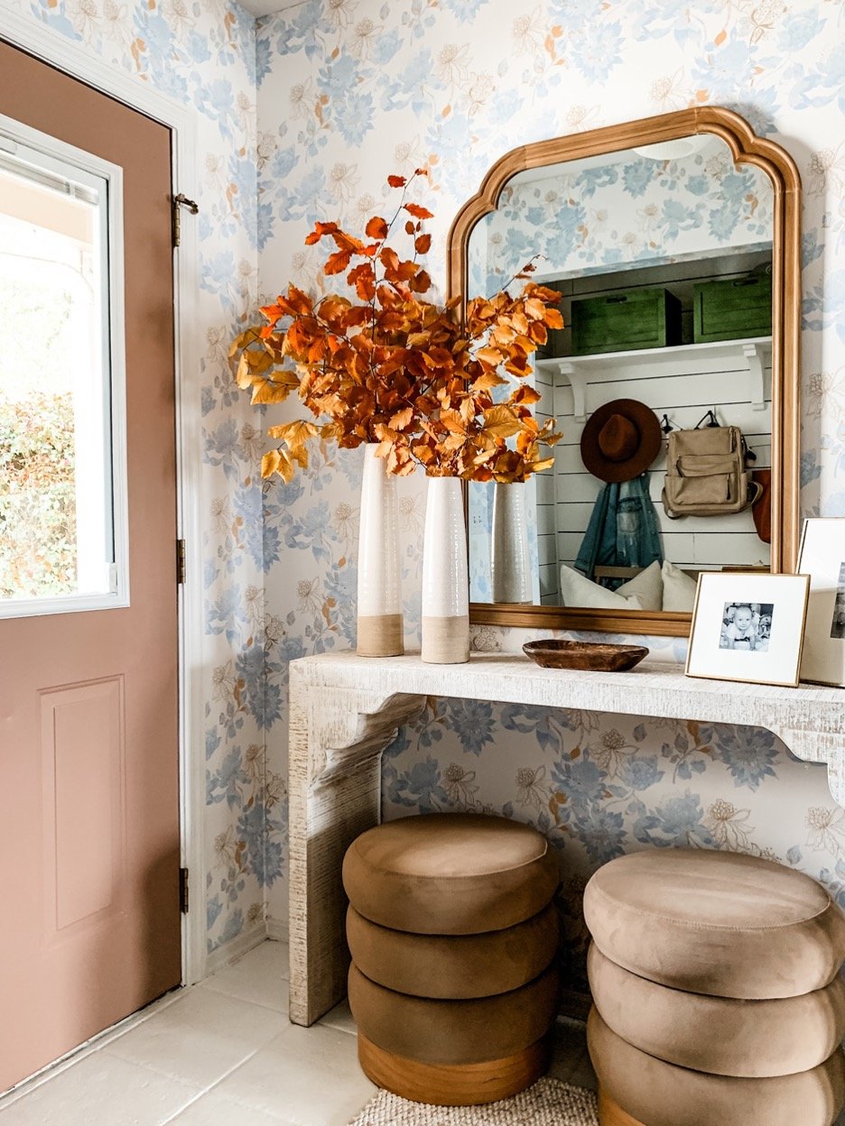
Milton and King wallpaper is truly my favorite wallpaper company. After a quick trip to visit my bestie in Dallas last year, which resulted in exploring downtown and visiting the Milton and King showroom, it was love at first sight. The company is so in tune with the current trends and pairs their designs with amazing customer service to boot. With so many patterns to choose from you really can’t go wrong. I selected this pattern from the Mauve and Oliver collection because it felt modern yet timeless, impactful yet not overwhelming, and airy with the right amount of punch. This collection has a few color ways to select from, my print is the blue bell honey and it’s oh so dreamy.
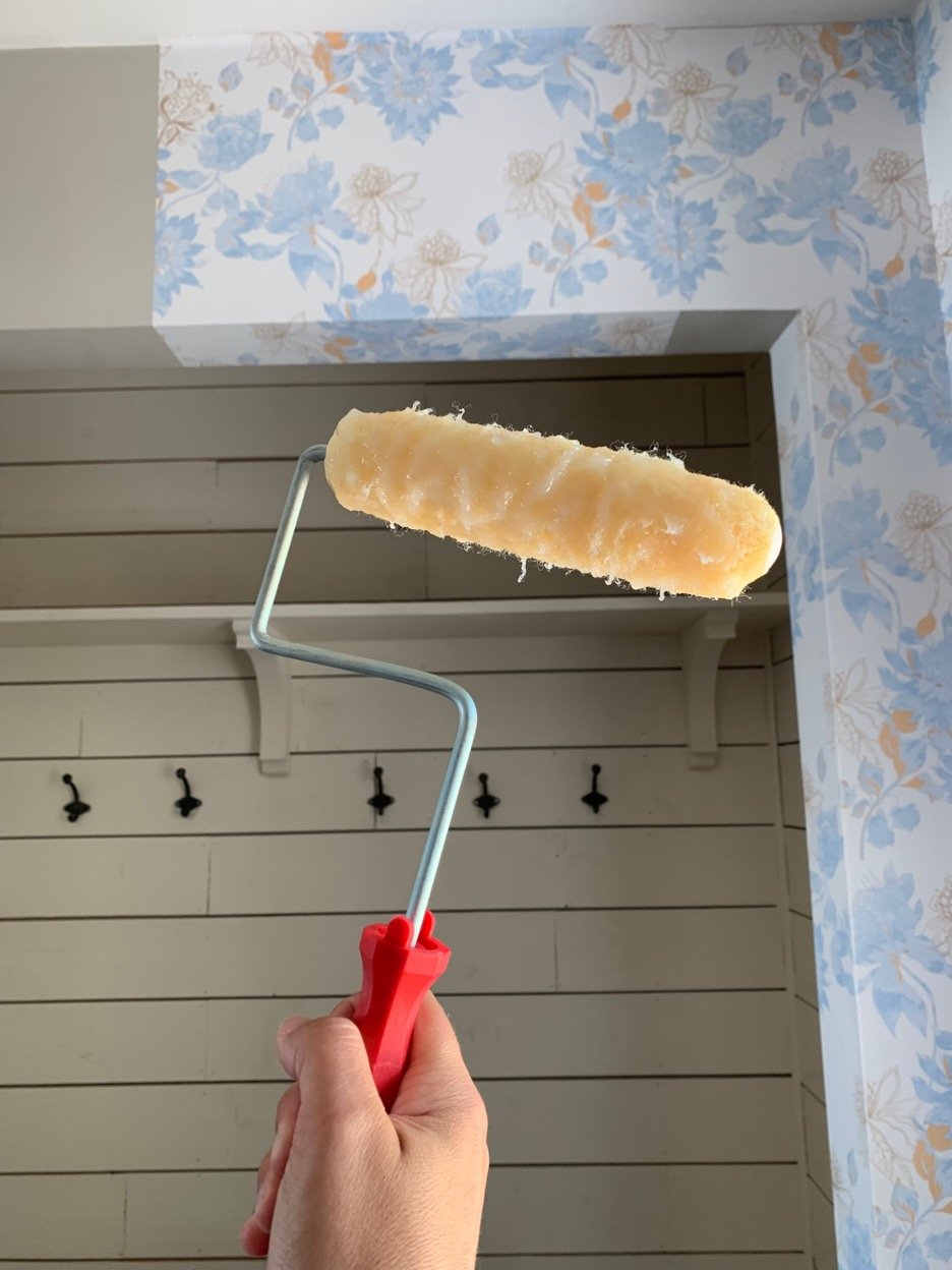
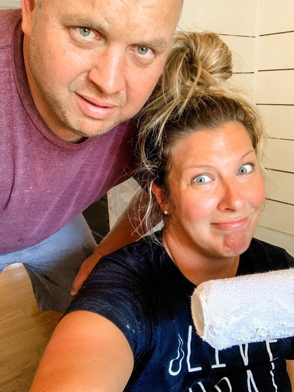
With a clean slate and the right tools in hand, I set out to create something that my family and I would find functional and stylish. The application process for the wallpaper went smoothly as soon as I found my rhythm. The key is to measure and align your pattern lines just right. Once you begin working with the wallpaper, you’ll get to know the repeating patterns pretty quickly. I used Roman Paste from Home Depot to apply the wallpaper. After rolling it onto the wall (much like you would apply paint) you’re all set to hang your paper. The best part is that you can manipulate the paper and adjust it once it’s on the wall, which allows you to align the pattern easily. After a little support from my sweet husband and a little, okay a lot, of sweat later we had ourselves some newly wallpapered walls in our entry. This paper really breathed a breath of fresh air into this small space!
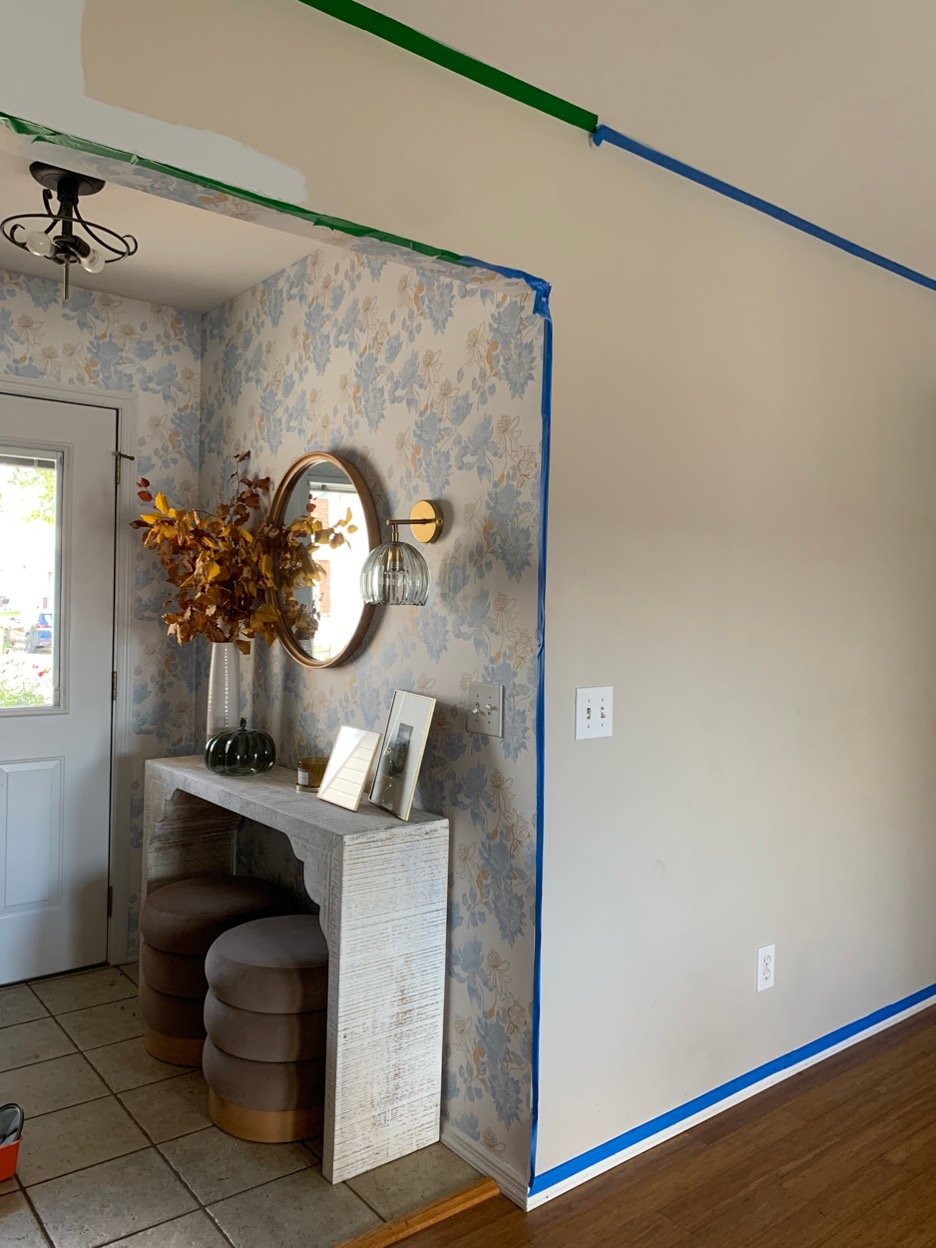
Once the wallpaper was hung, I had to freshen up the connected spaces to bring them up to speed. I always say, once you introduce something new to your space, the old often looks *really* old. So onward and upward! And speaking of Upward, that’s the name of the new Sherwin Williams color of the year for 2024! The soft moody blue paired seamlessly with the paper and allowed the adjoining wall to flow perfectly into our main living space. Also on the chopping block was the interior door (Redend Point SW) and the tile floors - it all needed a facelift to really allow the entire space to translate into the transformation I was aiming for.
Check out the before/during …
And … voila, the AFTER!! Check out this beautiful transformation!
Updating our entry with these small changes allows our home to feel more complete and inserts personality into the space that feels authentic to our lifestyle. I’m a big fan of wallpaper and would recommend it to freshen up any space to add a bit of pizazz! It was a small-ish effort (ha!) with a large impact!
Until next time!
XO,
Meg
Sourcing List:
WALLPAPER - Milton and King Wallpaper - Protea (Oliver and Mauve) - Blue Bell Honey
WALLPAPER PASTE - Roman Clear Paste - Home Depot
TILE PAINT - Rustoleum Tile Paint - Home Depot
WALL SCONCE - Clear Glass Fluted Flower and Brass Adjustable Wall Sconce - World Market
MIRROR - French Country Wall Mirror - Target
OTTOMANS - Tufted Ottoman with Wood Base - Target
WALL PAINT - Sherwin Williams - Upward 6239
DOOR PAINT - Sherwin Williams - Redend Point 9081


